This a rewrite of an article originally titled “Security incidents in Mali: mapping the hotspots” and posted on 2018/06/08.
In this post, I keep exploring the data on security incidents in Mali from this Malilink webpage. Here I introduce the notion of severity because I felt that is useful to remind ourselves that the incidents are not all equal. Some, while unfortunate, leave their victims with more unpleasant memories than irreperable scars (mass robbery for instance). Other, however, are devastating by their deadly nature (explosions, mass shootings, etc.). To take that into account, I thought it could be interesting to create a categorical variable that would serve as a facetting parameter. Hence this notion of severity. We’ll give it four values:
1: dead, injured ;
2: dead, no injured ;
3: no dead, injured ;
4: no dead, no injured.
It can be argued - and with merit - that this variable can suffer some bias. In it defense tough, that bias can be attributed to the very nature of the information provided.
Sometimes, the number of victims is not known right away. It only emerges afterwards, often long after the incident has been reported in the press, and the attention has shifted to another event. For example, some entries in the list indicate many injured without giving any precision. In such cases, an incident would fall into the second or fourth category simply because we don’t have a number, not because no one was injured. Other times, victims can succomb to their wounds. In such cases, an incident from the third category would be bumped to the first, and one from the fourth category to the second. Unfortunately, it is hard (next to impossible) to know all those things when entrying an incident. So, let’s keep in mind that the picture we’ll get from the data - as far as the victims are concerned - is based on the immediate fallout, not the long term impact.
With all that said, now let’s look back on the incidents through that new variable.
Rethinking the incidents based on their severity
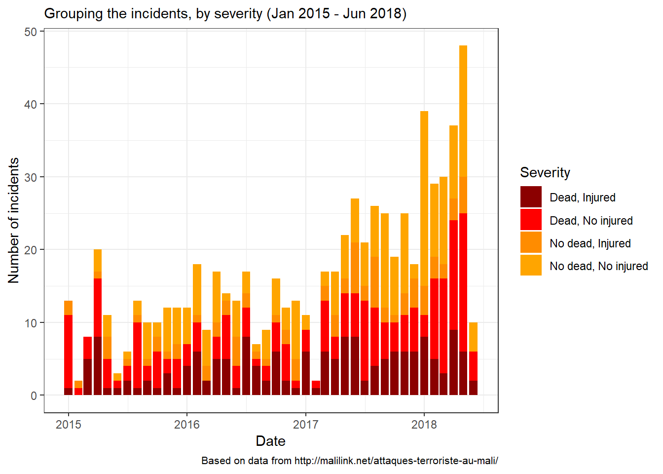
The graph above shows that the number of incidents has been consistantly increasing since the beginning of 2017. Let’s take a simple look at the table below to confirm:
| Severity | 2015 | 2016 | 2017 | 2018 |
|---|---|---|---|---|
| Dead, Injured | 26 | 46 | 63 | 33 |
| Dead, No injured | 51 | 36 | 65 | 65 |
| No dead, Injured | 15 | 21 | 33 | 17 |
| No dead, No injured | 28 | 54 | 69 | 78 |
| Total | 120 | 157 | 230 | 193 |
In 2017, the situation worsened compared to 2015 and 2016. Based on the count, 2018 did not show any sign of improvement over the three previous years. On the contrary! In less than six month, the number of incidents has reached a level larger than the overall count in either of 2015 or 2016.
Let’s translate these figure into a chart to read them in terms of shares.
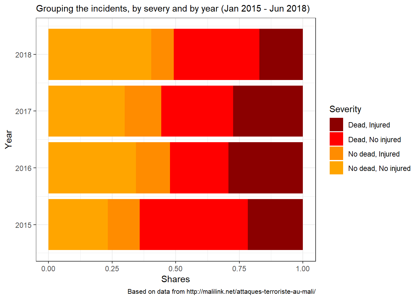
When we consider the proportions, the breakdown of the incidents by severity proves quite surprising. In 2015, about two thirds of the incidents resulted in death(s). The following two years fared better. In 2018, the share remains below 50% (so far - based on the data processed). However, that doesn’t mean that there were less deaths in 2018. It is the contrary, as we saw in a previous post. The fact that the share of the non-deadly incidents (as far as we know) has increased might be linked to reporting bias (the same kind we talked about early about, leading to miscount or misclassification of victims). It is possible that now incidents are being reported more than before, in which case even the non-deadly make it to the list. I can’t definitely support that based on the data (just being honest here), but given that we’re in a political season (recent presidential election and upcoming parliament elections), it is possible that people are paying more attention.
Now, let’s take a look at the trend to further our observation.
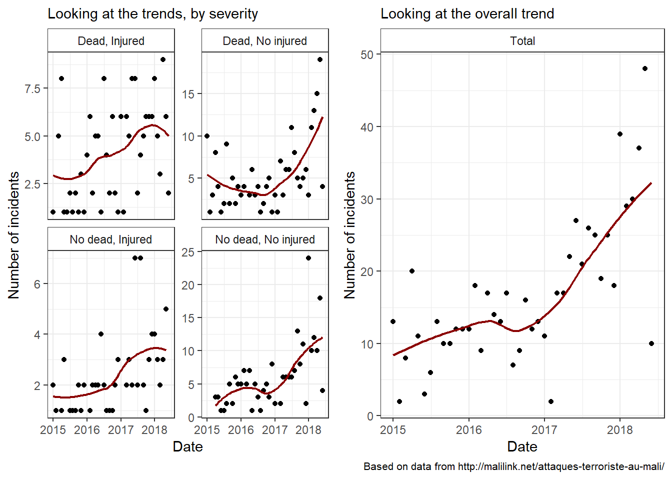
The graphs indicate that the situation is critical. And, based on the upward slopes, it’s been worsening for some time now. Whether they are going to remain that way or change in the near or distant future is a question beyond the scope of this post. But let’s be optimistic!
Adding the spatial dimension
Here, we will visualize the severity across the national territory. In previous posts, I split the incidents into two groups: that of the points and that of the lines. In the former, I put the incidents for which the places are clearly indicated and the coordinates known. This group makes up about 85.9% on the observations (676 out of 700 listed incidents). In the latter, however, we only have vague indications, mostly two points between which the incidents took place. For now, let’s focus on the former group.
The following map shows, for each known location, the number of incidents by year and by severity.
Looking at the points on the map, one can start to make out the areas that are affected the most by the incidents - depending on the type and the year of interest. One might wish to get a clearer picture by summarizing the information. Here, we’ll try two methods.
First, we simply agregate the number of incidents by administrative divisions. Let’s consider the region. Due to the small number (8 regions + 1 district), that is the level that lends itself the best to visualisation.
The second method consists of a visual approach, rather than a arithmetic one. We’ll use the function stat_density2d function of the ggplot2 package. Through a two dimensionnal density, we’ll be able to get a glimpse of the hotspots.
As for all the posts, this is - and is likely to remain for a long time - a work in progress. I still and will always believe in data, and in the power of knowledge, in its ability to change the world for the better.