This an update of the original post. It dates from 2018-12-27.
No shortcut to learning
When I started writing this post, I was fairly confident it would be quick. After all, I had all the materials I needed, a bunch of scripts I had spent months writing. It was supposed to be a matter of copy-and-paste. I was wrong. You see, once again, I underestimated the power of the monster in me who wants to get it right all the time. Don’t get me wrong. It’s always a good thing for one to strive to be their best self, and to give the best of what they’ve got. In my case, unfortunately, that line always seems to get further away as I get close to it (I can only imagine the head some of my friends would make when reading this). This post was no exception.
I was still learning ggplot2 when this data science project came about. If I’m honest, I would say that I was still in my honeymoon phase. I simply couldn’t get enough of ggplot2. So, it only seemed natural to use it for the project. At the beginning, my main outputs were pdf files. So, I had no reason to think beyond ggplot2. Then, the idea for this blog came, and I realized that interactive visualization would be a better way to go. I had to chose a package. Three options were available to me: ggvis, plotly, shiny.
I had a strong leaning towards ggvis, on which I had already taken few courses online. I loved it. It was simply the follow-up act to ggplot2. Apart from few adjustments I had to be mindful of (trading + for %>%, = for =~ or :=, geom for layers, etc.), I felt home. Unfortunately, the package is currently dormant. That deterred a bit.
So, I considered the second option: shiny. I had dabbled in that one too. But just dabbled. I knew about the basics, but not enough to feel confident to use it for an entire project. I still hadn’t gotten the hang of the all the details about the user interface and the server. With what I knew of ggplot2, just a little would’ve sufficed to make me pick shiny, but I didn’t want to embark on a another long learning journey. So, I passed.
Then, entered the third option: plotly. That one caught my eye a long time ago, long before I reconnected with R, but I was intimidated. I thought it would be too complicated to learn (just like with shiny…seeing a pattern of laziness in here?). Also, I was getting a little bit comfortable with the little I had learned on ggplot2. In my mind, I could’ve gone a lifetime without ever needing plotly. One detail made me reconsider my position: ggplotly. Realizing that I could create an object with ggplot2, pass it to ggplotly, and have a plotly object was - to put it like teenagers - dope (please don’t tell me I’m outdated on that one already). But, then, I reached the limits of the function. I was not getting everything. Some details were being lost, like the subtitles or the captions.
In the end, I found myself in a pickle. With ggplot2, I was going to miss out on the joys of interactive visualization. With ggplot2 + plotly, I was going to lose some of what makes ggplot2 great. And, with shiny + one of either, I was going to have to learn a lot. I spent days weighing my options, going back and forth between chunks of codes, hoping I would find a way around the issue. I didn’t. But I knew one thing for sure. ggvis was not a viable an option. Unlike plotly or shiny, it was not being being maintained and developed. For all I know, it could be in its grave (I dread that fate so much that I shiver at the thought of it), or taking a long nap before a comeback (like a Mommy…well a good one…like those released in the early 2000’s…not the one we recently got…sorry Mr. Cruise…I’m still on board with the MI franchise). I ended up spending long hours watching Youtube videos (which is now the place I go to learn rather than to find the latest music videos, like back in the days…I miss the good old times) and surfing websites with tutorials on plotly and shiny in R. I still am not there yet, the place where I feel the confidence that only mastery can bring. But I understood few tricks. Mostly, I only set out translate my old ggplot2 graphs into interactive shiny-powered plotly ones.
What I took away from the experience behind this post is this: there’s no shortcut to learning, and nothing is truly ever lost (hum…that sounds profound… Ok, mark that, and write it on my grave when I’m gone). This project helped me understand the tools aforementioned better than any previous tutorials I took online. Probably because I was less concerned with reproducing what I had in front of my eyes than I was trying to make sense of the data I had through visualization.
This post was initially meant to be a simple rework of scripts I had previously written. It ended up being a shiny/plotly-centered episode in an incidents-focused season (if you are/were a Lost fan, you’d get it).
I learned how to:
make a shiny app with plotly (ggplot2, distance makes heart grow fonder…I’ll come back to you);
publish a shiny app: I a got myself a shiny account (for free… well, at least for now) and almost lost my mind in the deployment process (it kept failing over and over again) ; and
embed a shiny app in a blog post.
I’m pretty sure I’ve grown few gray hair during these last few days, but it was worth it.
Interactive visualization
As I got more and more comfortable with the tools, I realized I didn’t want as many graphs as I had on the slides I previously made. And with interactive visualization tools such as shiny and plotly, I didn’t have to. And with the limit set by my shiny account, I couldn’t anyway (yeah…I’m still going for the free stuff). Basically, I had all the incentives in the world to be as creative as I could. Considering the constraints I had to work with, I needed to come up with visualizations that would lend themselves to multiple requests from the user, that would be able to communicate different information without having their nature altered. So far, I’ve made three apps that I like enough.
Exploring the attributes of the incidents
Depending on the transformation one would choose, the original list could be either a panel data or a time series. To make things simple, I chose the latter - opting for a monthly agregation -, and to go with it a barplot. That seemed a simple way to explore the attributes of the incidents. For the app, I chose four variables:
number: a simple monthly count of the incidents;
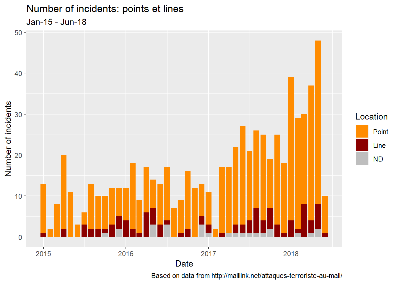
location: as indicated in my previous post, I distinguish between the incidents that took place at know locations - meaning known coordinates - and those for which such details are not provided. Only the places between which they occured are known. That creates a dichotomy, points versus lines, that I found useful to represent;
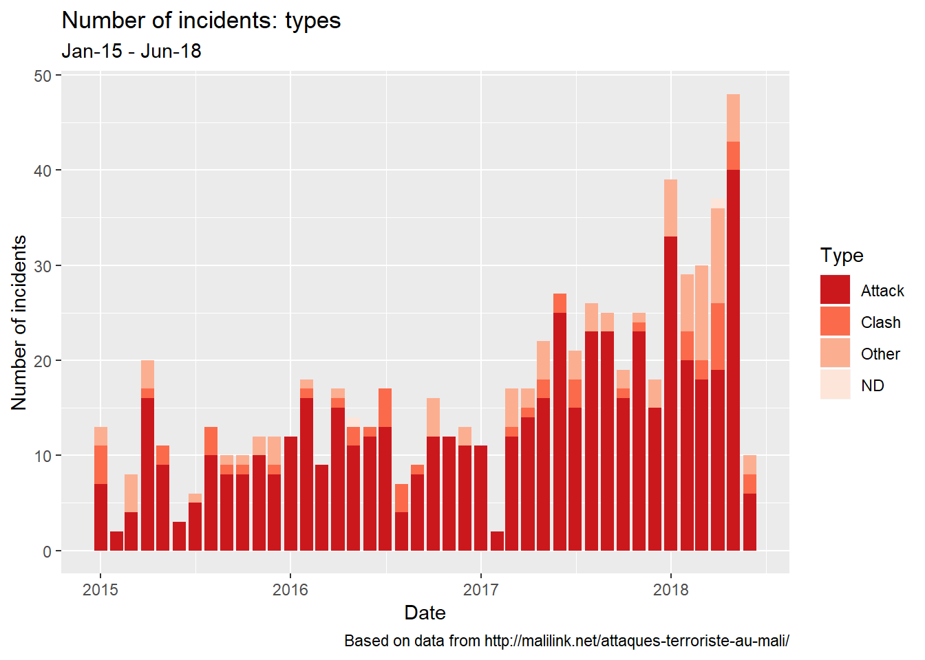
type: this variable indicates whether an incident was an attack from an armed organization (terrorist or not), a clash between communities (ethnic groups), or of different nature (all the rest);
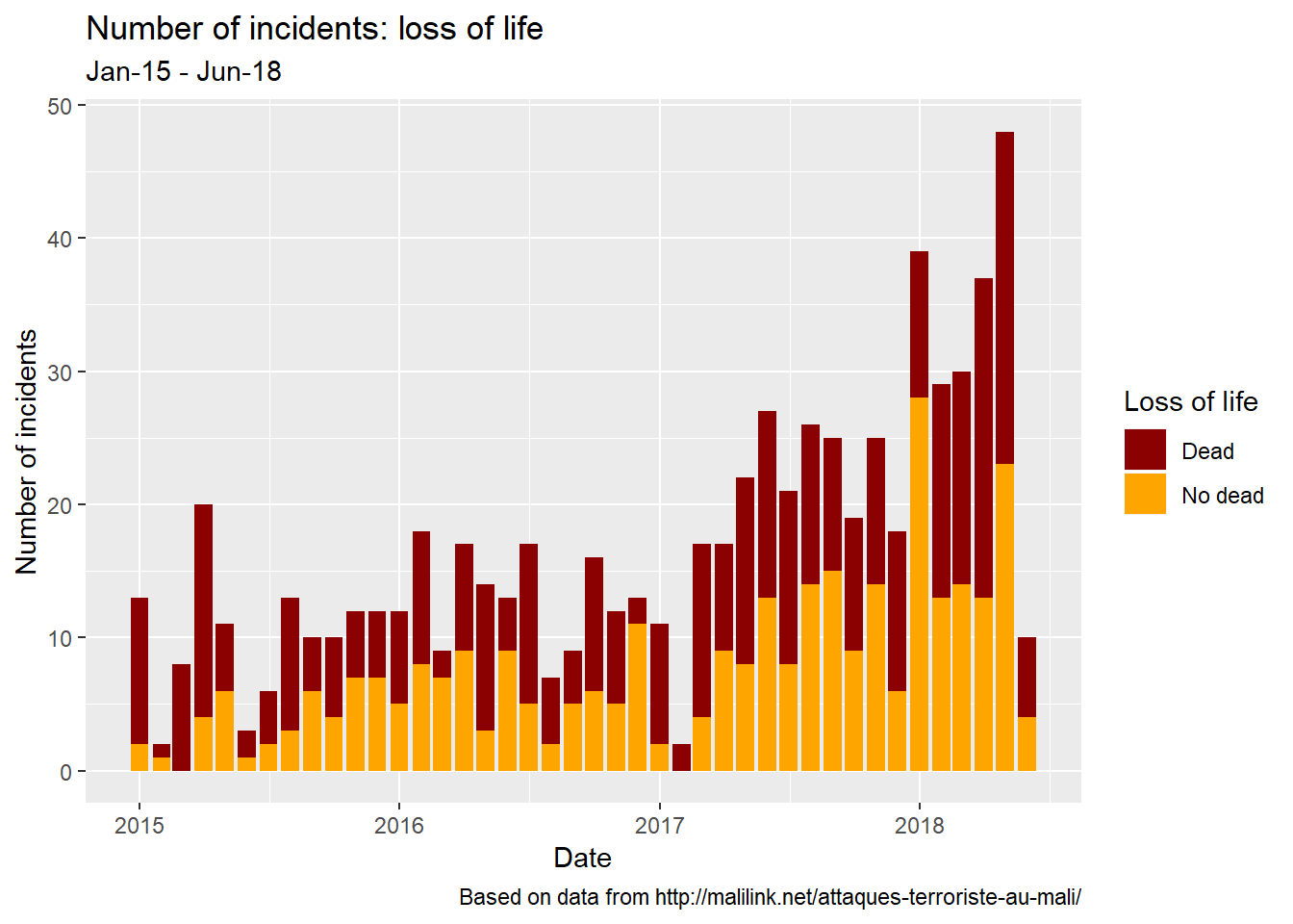
deadly nature: that variable shows whether there’s been a loss of life or not, regardless of the side which suffered that loss. I felt that taking into account the identity would be going beyond a simple observation, for which I don’t think I’m well equiped.
Looking into the major variables throughout time
After exploring many other visualizations, I decided to focus - at least, for this phase - on three variables:
the incidents;
the dead; and
the injured.
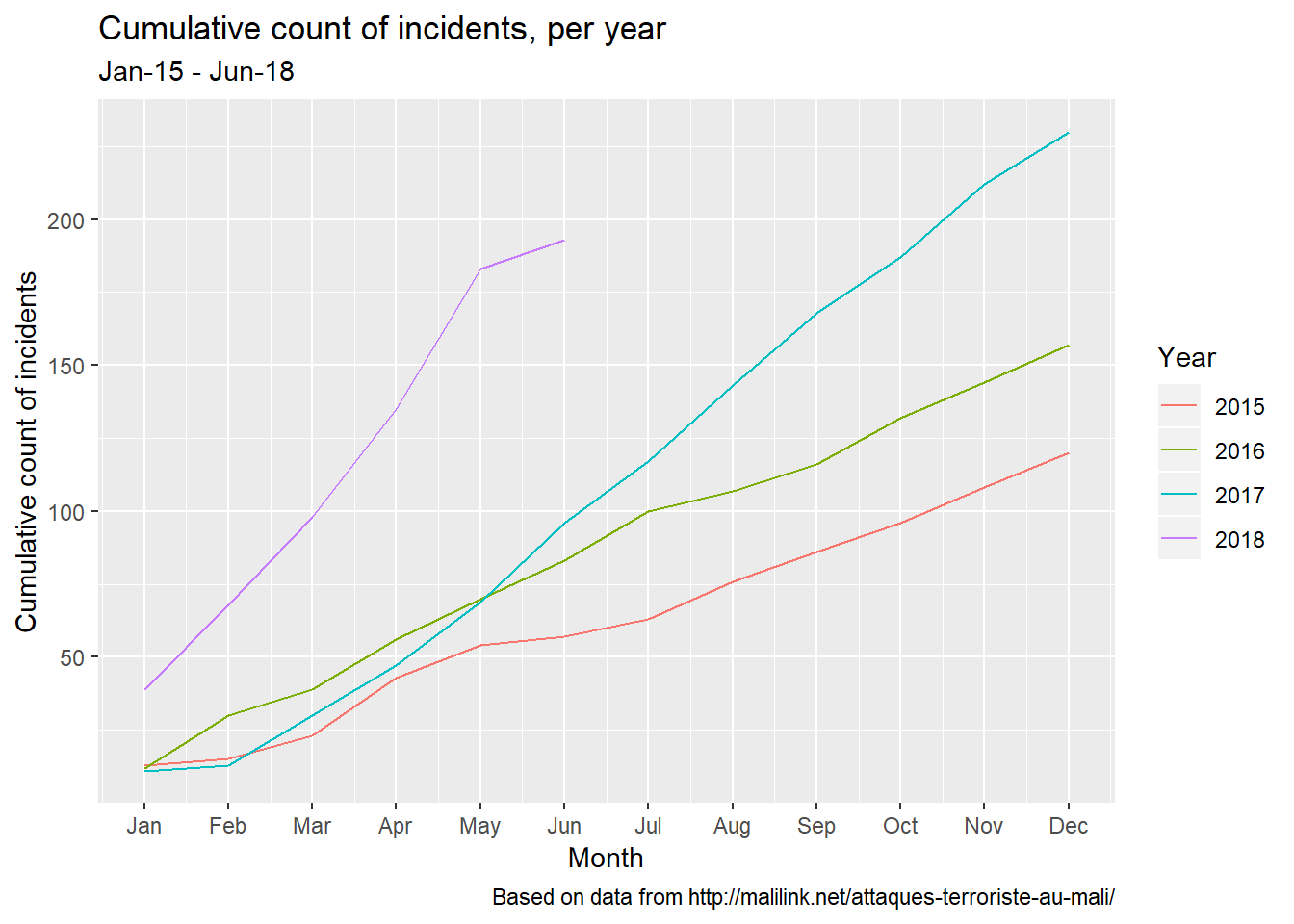
I though it would be interesting to look at the cumulative counts:
- since the beginning of the series, which is 2015 (it would’ve been great to have a series that starts in 2012);
- per year.
The result is shown below:
Adding a spatial dimension
Using the same variables, I added an interactive map to represent the yearly count for each of them.
The good old fashioned ggplot2…just in case
Few months have passed between the original post of this article and the rewriting.
After countless visits of this post, I realized that the shiny apps were not always working. Hey, what can I say? That’s the price you pay when you want the free stuff! Anyway…I decided to go back to my old flamme - this good old fashioned ggplot2 - and include few graphs to have something to look at in case the shiny apps are not available.
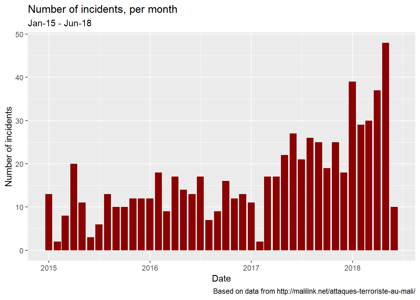
Incidents
Let’s go back to the incidents.
After a look at the big picture (monthly counts)…
…we’ll break the numbers based on various characteristics: the location…
…the type…
…and the deadliness.
The cumulative counts
As above, let’s explore the cumulative counts for the incidents themselves…
…and the victims they make.

This rewriting goes to show that sometimes you definitely have to get away from something/someone you like to truly know their worth. I hope in this will serve as a lesson for everyone out there who’s thinking about breaking up… with someone or something. Bottom line: sorry ggplot2.
Despite using a light tone, I know the situation is very concerning in my country, Mali. I pray that things get better. And I hope that looking into the data will help.